
Figma Bootstrap 5 UI Kit
 1 sales
 Recently Updated
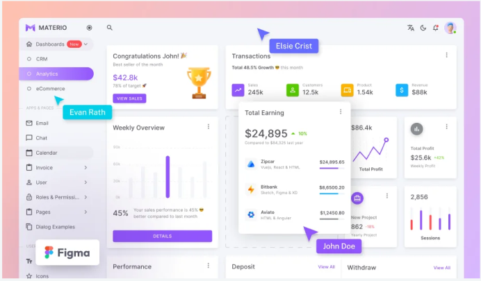
Figma → Bootstrap 5 UI Kit — Professional Overview & Quick Guide
Nice — here’s a tight, ready-to-use description + quick docs for a Figma UI Kit built for Bootstrap 5. Use this for a product page, README, or to onboard designers/developers.
Product Summary
Figma Bootstrap 5 UI Kit is a fully organized, responsive Figma design system that maps directly to Bootstrap 5 components and utility classes. It accelerates design → dev handoff by providing pixel-perfect components, layouts, and tokens that align with Bootstrap’s grid, breakpoints, spacing, and color system.
Ideal for teams that want consistent UI/UX, rapid prototyping, and clean implementation in Bootstrap 5-based projects.
What’s Included
Design Tokens
Color palette (primary, secondary, success, danger, warning, info, light, dark)
Typography scale (headings, body, captions) mapped to Bootstrap font sizes
Spacing tokens (xs → xl) matching Bootstrap 5 spacers
Border radius and shadows
Grid & Layout
12-column responsive grid frames for XS → XL breakpoints
Container widths matching Bootstrap (container, container-sm, etc.)
Helper layout templates (header+hero, two-column, dashboard grid, forms page)
Core Components (Figma components + variants)
Buttons (primary, outline, sizes)
Forms (inputs, selects, checkboxes, radios, switches, input groups)
Navbars (collapsed, expanded, with dropdowns)
Cards (basic, media, stats)
Tables (striped, hoverable, responsive)
Modals & Offcanvas
Alerts, Badges, Tooltips (mockups), Toasts
Pagination, Breadcrumbs
Tabs & Accordions
Lists & Avatars
Charts placeholders & data cards
Footer templates
Advanced / App UI
Dashboard widgets (stats, KPI cards, activity feed)
Sidebar templates (collapsible, icons + labels)
E-commerce product cards and checkout form
Profile & settings pages
Authentication screens (sign in/up, forgot password)
Assets
Icon set mapped to common icon libraries (Bootstrap Icons / Remix Icons)
Common illustrations and placeholder images
Sample images & avatars
Documentation
Component usage rules, spacing & layout guidelines, and Bootstrap class mapping table
Export notes for developers
How it Helps (Design → Dev Workflow)
Designers build screens with components that directly map to Bootstrap class patterns — fewer “translation” mistakes.
Developers receive Figma specs (inspect) where tokens correspond to Bootstrap variables (colors, spacing, breakpoints).
Speeds up prototyping: drag & drop components, duplicate variants, iterate, then export assets/CSS-ready measurements.
Encourages consistency across pages and teams.
More Items
View Author Profile
No reviews available yet.

0 Comments